Inside DREAM for NYC's viral design

In our new members-only feature, Extras, Extras, we’re bringing you all the extra behind-the-scenes info from our reporting that didn’t wind up in the final story. The DVD bonus features of journalism, if you will.
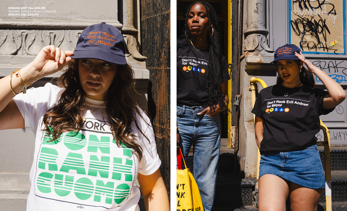
Besides the intoxicating rush of collectively hating on a guy who sucks, the DREAM for NYC campaign against Andrew Cuomo had another key weapon in its arsenal: the power of good design.
After all, even if they already agree with your message, people are a lot more likely to start wearing your merch en masse if it actually looks good. Zohran Mamdani’s own campaign understood this too, creating a colorful, engaging design that was inspired more by New York City iconography and bodega signage than the same political lawn signs your eyes have glazed over for decades.
In our conversation earlier this week with one of the scrappy super PAC’s organizers, Charlie Heller, we dug further into the DREAM campaign’s own usage of city imagery and signs on Canal Street to create their viral merch.
On creating political merch people actually want to pay attention to:
Our kind of philosophy that we found worked was: you want to seem not political. You see a political ad that uses the same font, same background music, same “so and so says this, but so and so says that” your brain just shuts off. That stuff can work if you have infinite money to make people see it a billion times a day. If you don’t have that kind of money, you have to do it differently.


