Get to know the MTA's first new subway map since 1979
Let's celebrate a complete and unequivocal win for the MTA, shall we?
Can we interest you in a rare spot of unproblematically good news? About the MTA, of all things? Great, because yesterday transit officials unveiled a chic new version of the subway map, marking the first full update since 1979.
“The new MTA is focused on a quality, 21st-century customer experience, and it’s about time our map caught up,” MTA Chairman and CEO Janno Lieber said at a press conference Wednesday morning. “The new version is much easier to read while also reflecting all the enhancements we’ve made over the years.”
It’s also, objectively, much cooler looking — you can explore the full map here — according to laypeople and design-heads alike (and no less than Sarah Jessica Parker).
“I’d like to give the MTA credit for pushing forward on a cleaner, modern map,” Vanmaps designer (and transit map aficionado) Andrew Lynch told The Groove. “The MTA gets a lot of flack for everything they do, so it’s important to credit a win.”
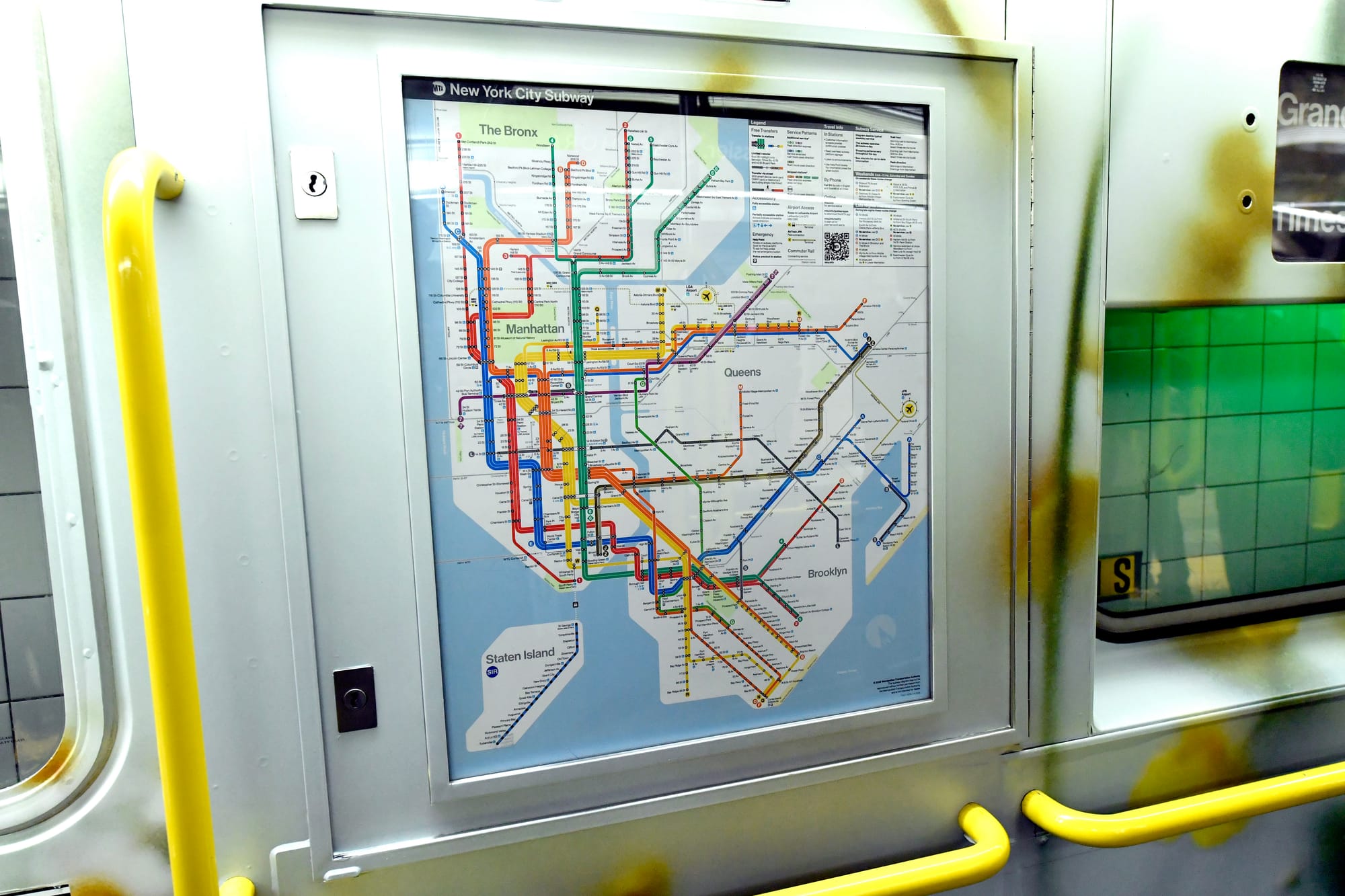
As the new maps begin to roll out across the transit system (they’re already available online and on the system’s digital screens), here are a few of the headline items to know about this once-in-a-half-century update:
The aesthetic was a high priority
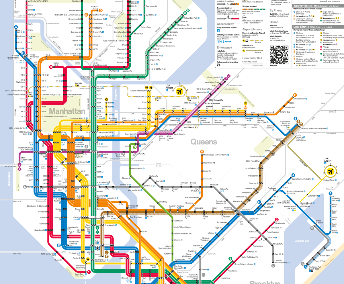
Though it was retired in 1979 in favor of a design officials felt was easier to understand, Italian designer Massimo Vignelli’s 1972 subway map remains the stuff of design legend, and served as a major inspiration for the MTA Creative Services Mapping Department’s new design as well. Specifically, the new map uses “a similar geometric and diagrammatic aesthetic” as the 1972 map, per an MTA press release.
To put it another way, those tidy bunches of lines are back, instead of the more-realistic-but-also-overwhelming snarl of disparate lines that characterized the map we’ve had for the last half a century. Every train gets its own line on the new version, so you won’t, for instance, see the A and C trains represented as one blue line when they’re not all making the same stops. Designers also made a point of visually clarifying key data points like what transfers are actually available at Union Square, and where the hell the skip-stop Z train does, in fact, stop.
The new map is also more accessible
This one’s true in a couple ways. Design-wise, the MTA notes that “white background, bold colors, horizontal writing and use of black dots make the map more ADA-friendly and easier for people with low-vision or cognitive disabilities to read.”
The design is also easier to follow for digital users.
“With smartphone apps, you've got an interaction geographic map in your hands,” Lynch said. “A diagram like this is more helpful for just getting from A to B.”
The updated map also includes accessibility, transfer and safety information about stations, making our generally disability-unfriendly system at least somewhat more transparent to navigate. Anecdotally, I’ve witnessed riders trapped on the train and desperately trying to find out which is the nearest station that actually has an elevator, so this is no small thing.
And while it’s early days for user reviews, one commenter posted on Gothamist, that the map could help unsnarl some of the most confusing lines: “We live in Rockaway Beach with autistic teenage kids. If you’re in the city, there are three A trains, then two to the Rockaways, and if you’re not careful, you can get stuck. This map makes it so much easier to see exactly which section is which, especially for kids/visitors learning the system.”
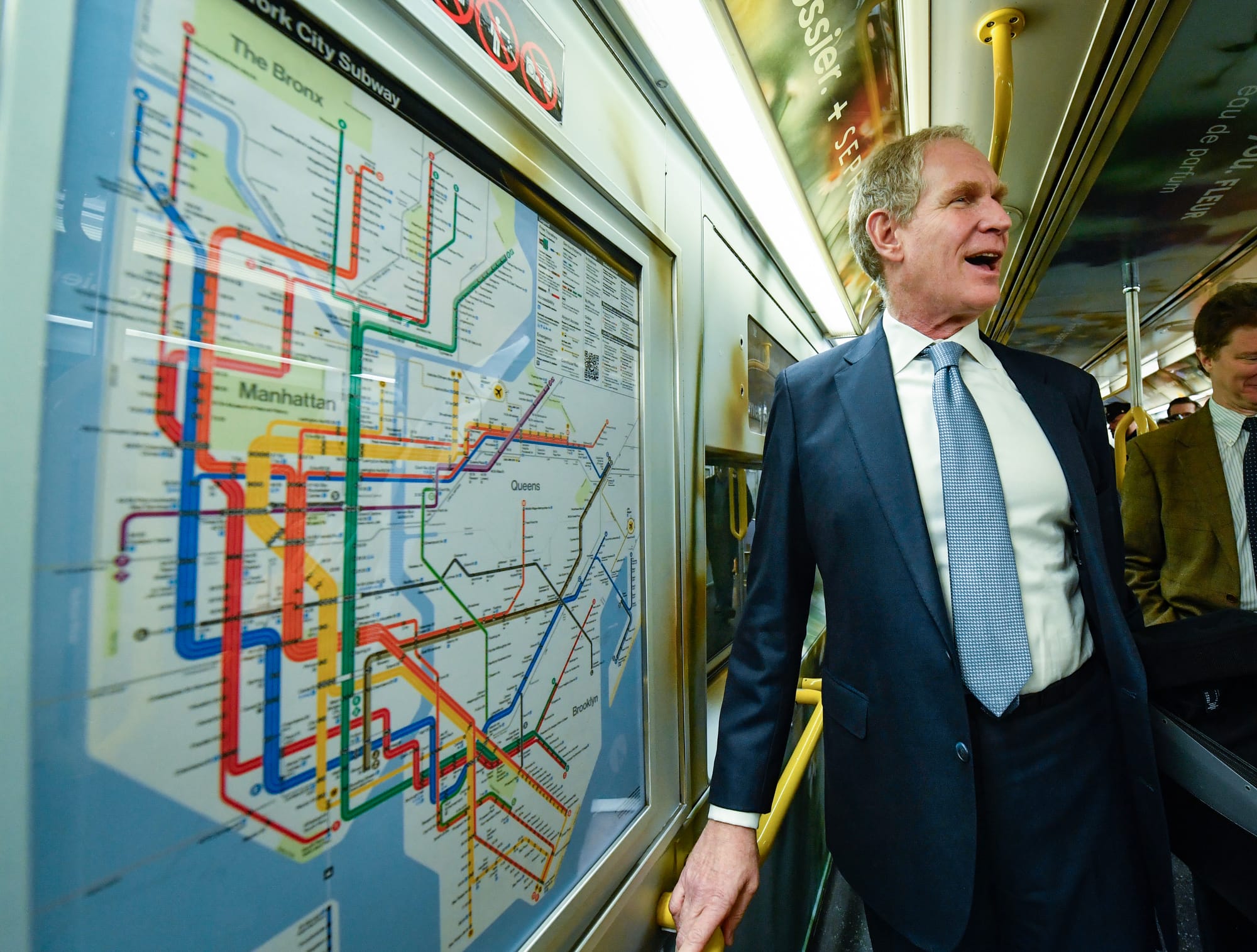
MTA Chair Janno Lieber shows off the chic new maps in the wild. (Photos via Flickr/MTAphotos)
It’s part of a larger suite of updates
The new map rollout is part of a larger round of improvements that includes more frequent updates being pushed out to digital subway screens, which will now get new data every five seconds in order to more accurately align with the countdown clocks, which themselves have gotten a well-received redesign. There will also be more screens in the system issuing alerts for approaching trains.
I may not be a fan of the new subway cars (which Dave continues to be wrong about) but am pretty thrilled to hand it to the MTA when something is going very right, a feeling I’m not sure I’ve had since the heyday of Andy Byford’s tenure. The new maps both look great and are easier for people to actually use; dare I say something the city can sincerely take pride in?
“The subway map is both an iconic symbol of New York and a tool that everyday riders and first-time users of our system use to get around,” New York City Transit president Demetrius Crichlow said in yesterday’s press conference. “This modern redesign makes it easier to navigate the system — especially during service changes — and has a quintessential New York look that riders will appreciate for years to come.”


Comments ()